On Display: The Future of Museums


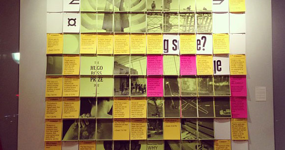
The Superscript wall at New York’s MAD after the third On Display event. Photo by Aileen Kwun

As part of the MAD museum’s The Home Front 2013: After the Museum exhibition and series of events, editorial consultancy Superscript (which I co-founded) alongside HAO and Neil Donnelly proposed a series of panel discussions titled On Display. In each of the events, a simple starting point was used to discuss issues around objects, exhibitions and location in the future of museums. While discussion progressed, a wall in the exhibition gallery was transformed with live inputs from the discussion, such as images, quotes from readings, or comments by participants in the discussion. The results of the three events will be compiled soon in a publication.

I was fortunate to participate in one of the discussions on the occasion of my last trip to New York. On Display #3 focused on location, and started with the location of MAD — 2 Columbus Circle — to then question physical and virtual locations of museums, collections and galleries today and in the future. For me, it felt just like coming home — so many friendly faces! —, and it was a pleasure to participate in a discussion expertly led by Molly Heintz and Avinash Rajagopal.

The Collective Story


Unfold’s Stratigraphic Manufactury, part of Adhocracy. Photo by Benoit Palley

In order to celebrate the opening of Adhocracy at the New Museum, in New York, below is the essay Avinash Rajagopal and I wrote for the exhibition’s catalog, introducing the volume’s intentions and structure. The catalog is available at the New Museum store. Make sure to visit the show, which will be on through 7 July at Studio 231 at 231 Bowery.

The Collective Story
Avinash Rajagopal, Vera Sacchetti

At first glance, what does a film about superannuated gardeners in Barcelona have to do with 3-D printed ceramics from Antwerp, or an open-source tractor built on a farm in Missouri? The many manifestations of adhocracy—the conviction that societal change can come out of small interventions, little subversions, and closely-knit communities working without the aid of the powers-that-be—can be surprisingly, and affirmingly, diverse. If only all these local agents who create tirelessly within their own online and offline communities could speak to each other, then a powerful new mode of creativity could take over the world—or at least that is the dream.

Continue reading The Collective Story

The Milan Breakfasts 2013


The Milan Breakfasts, 2013. Photo by Ilco Kemmere

During the 2013 Salone del Mobile in Milan, I participated in one of Premsela/DAE’s Milan Breakfasts, discussing Linking Process alongside moderator Tracy Metz, DAE’s Miriam van der Lubbe, V&A’s Corinna Gardner and Vitra Design Museum’s Marc Zehntner. The breakfasts have become a staple of the Salone in the last years, and I was delighted to have the opportunity to discuss the display of designer’s processes in recent exhibitions and in the museum and gallery context. Discussion was accompanied by coffee and brioches (the Milanese term for croissant), and a podcast of the hour-long discussion can be heard on Soundcloud. Thank you to DAE/Premsela!

Printable futures


A view of DUS architects’ studio. Photo by Hans Vermeulen

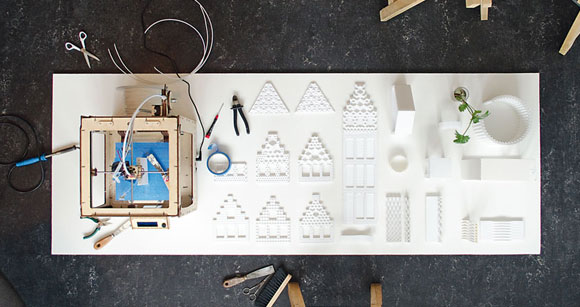
The April 2013 issue of Domus features my story on DUS architects’ KamerMaker — a large-scale, mobile 3D printer — and their project to built the world’s first 3D printed canal house, room by room, in the north of Amsterdam. The project seeks to revitalize a run-down area in the north of the city, and I was fortunate to visit DUS’ studio on a grey March morning to see the KamerMaker for myself. The full feature is available to read online over at Domusweb, and an excerpt can be seen after the jump.

Continue reading Printable futures

Art beacon in the Mediterranean


The open-air gallery of Mangiabarche. Photo Beyond Entropy

The March 2013 issue of Domus features my piece on the open-air gallery of Mangiabarche, in Calasetta, Sardinia. This was a truly special place that I was lucky enough to visit late in 2012, which defies the conventional notions of what a gallery space is and can be. This feature also marks the first time I write about contemporary art and politics of territorial occupation. The full piece can be read over at Domusweb, and an excerpt can be found after the jump.

Continue reading Art beacon in the Mediterranean

Beyond the Tin Can Radio


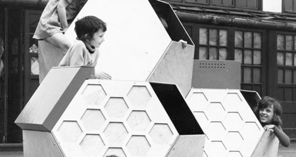
Moveable Playground Structure by Victor Papanek. Image courtesy Victor J Papanek Foundation

The 3rd issue of Disegno magazine features my story on the Victor J Papanel Foundation and its making, and tries to shed some new light on this controversial figure that has become the symbol of an entire movement in the early 2000s. I was privileged to have interviewed both Thomas Geisler and Martina Fineder, who were responsible for tracking and putting together the Papanek Archive in Vienna. The full piece is available online over at Disegno Daily, and an excerpt can be read after the jump.

Continue reading Beyond the Tin Can Radio

The Adhocracy Reader


The Adhocracy Reader, page detail. Photo by Ethel Baraona Pohl

During the summer of 2012 I was lucky enough to be involved in the preparation of Adhocracy, an exhibition curated by Joseph Grima with Elian Stefa, Ethel Baraona Pohl and Pelin Tan for the 1st Istanbul Design Biennial. My collaboration with the team materialized in the exhibition catalog, which I co-edited with Avinash Rajagopal and Tamar Shafrir. The Adhocracy Reader was designed by Folder (Marco Ferrari and Elisa Pasqual), and in its 400 pages we tried to push the concept of a standard catalog and create a reader, evoking a standard college reader — a compilation of pre-published material. A series of introductory essays frame the exhibition’s premises and the catalog’s intentions, followed by a carefully curated selection of material on the projects on display in the exhibition, alongside a series of pre-existing essays. The whole catalog can be consulted on Issuu, and a Flickr photoset by Ethel Baraona Pohl can be seen here.

The Social Network


Marcelo Rosenbaum and Pedrita in Piauì, during AGT #2. Photo courtesy A Gente Transforma

For the September/October 2012 issue of Frame magazine, I wrote a feature article on the current state of social design, and focused on a few projects that I believe are shaping the future of the field. One of them is A Gente Transforma [“We Transform”], a project by Brazilian designer Marcelo Rosenbaum (pictured above). The text dovetails with the research I have developed for my masters thesis, and continues my investigation into a direction which I hope to further explore in the future. An excerpt of the piece can be read after the jump.

Continue reading The Social Network

Concrete Mushrooms


Concrete Mushrooms. Photo by dpr.barcelona

During June and July 2012, I copy-edited and helped Elian Stefa finish the book Concrete Mushrooms: Reusing Albania’s 750,000 Abandoned Bunkers, which was then published by dpr.barcelona in August 2012. The book, in Albanian and English, traces the history and fascinating “bunkerization” of Albania during the last years of Enver Hoxha’s dictatorship, and proposes a series of uses for these now discarded military structures. The project was originally started as a research project at the Politecnico di Milano. In August 2012, Concrete Mushrooms was also one of the initiators of Concrete in Common, an exhibition at  the Kunst Raum Riehen, in Basel, Switzerland — which I reviewed for Domusweb —, and was presented as one of the projects in the Albanian Pavilion at the 13th International Architecture Exhibition — Venice Biennale 2012.

Grey areas

When Frederico Duarte asked me if I’d be into having a conversation about social design in Portuguese, I was instantly game. Over email, we had a fun back and forth that became a section of the Portugal e África: Melhor Cooperação, Melhor Desenvolvimento [“Portugal and Africa: Better cooperation, better development”] book, a publication of the ACEP — Associação para a Cooperação Entre os Povos. This was the first time me and Frederico collaborated, and it was an immense pleasure to finally pen something with him. The full book can be seen at the ACEP website in PDF, or it can be ordered at info@acep.pt. After the jump, the full conversation between me and Frederico — unfortunately only available in Portuguese.

Continue reading Grey areas

The Tipping Point


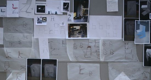
Sketches for the Tip Ton chair, by Barber Osgerby. Photo by Felix Friedmann, courtesy Disegno

The first issue of design, architecture and fashion magazine Disegno includes my 3,000-word essay on Barber Osgerby’s Tip Ton chair for Vitra and the process behind its making. It was a challenge and an honour to write this piece, and I was very pleased with the result. The magazine can (and should!) be bought here, and the full feature article can be read online over at Disegno Daily. An excerpt after the jump.

Continue reading The Tipping Point

On Banana Fibers: Considering the Social Mandate for Design


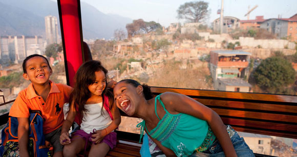
Metro Cable in Caracas, Venezuela, featured in the MoMA exhibit “Small Scale, Big Change“. Image credit: Iwaan Ban.

I co-wrote this article with Avinash Rajagopal as part of the second issue of the “New City Reader — A Newspaper of Public Space,” October 22, 2010. This was a newspaper edited by Joseph Grima and Kazys Varnelis, as part of the New Museum’s “The Last Newspaper” exhibition, which ran from October 2010 till January 2011.

Elizabeth Scharpf reached into a tote bag, and with all the flair of a Vegas conjuror, pulled out strand after white candy floss strand of banana fibers. “This is the local material we chose to work with,” she announced. The rabbit Scharpf was pulling out of the hat was her miraculous sanitary pad innovation for Rwandan village women. The occasion—her acceptance speech for the Curry Stone Design Prize 2010, which she won for the “social venture SHE which launches businesses to address some of the world’s most pressing problems.”
As ever, the world seems extraordinarily pressed with problems. The ice caps are melting, ducks are covered with crude oil, children are starving somewhere in Africa, and we’re losing our jobs. If the multitude of conferences, awards and exhibitions in New York are anything to go by, architects and designers are all over it. The Cooper Hewitt’s Why Design Now? symposium—where Scharpf’s banana fibers were first greeted by appreciative titters—answered its titular question with the rather ambitious title “Solving Global Challenges.” A new show at MoMA, Small Scale, Big Change, is advocating social engagement in architecture, through eleven projects from around the world. And the Curry Stone Design Prize 2010 puts a $100,000 price tag to addressing “critical issues such as access to clean air, food and water, shelter, health care, energy, education, social justice and the promotion of peace.”

It’s clear to any designer listening—big problems are the only problems worth solving. The first of which, of course, was the inconvenient truth. But with its emphasis on reducing materials and cutting back on wasteful consumption, sustainability could only offer so much fuel for the design machine. Design has since moved from protecting the ozone layer to saving underprivileged people. At the Why Design Now? conference, the panel on green design was just a pit stop on the way to the biggest goal of them all—Design for Social Change.

Continue reading On Banana Fibers: Considering the Social Mandate for Design

Legerdemain


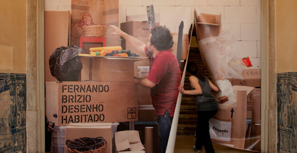
The entrance of Fernando Brízio: Inhabited Designs, at EXD’11/LISBOA. Photo: Luís Rocha.

I recently contributed to the companion brochure of EXD’11/LISBOA’s retrospective exhibition of the work of the contemporary Portuguese industrial designer Fernando Brízio. Titled Legerdemain, my essay sought to understand Brízio’s posture and design production, placing him in context among other international designers of his generation. I originally wrote in Portuguese, and the text was translated to English by the lovely Rute Paredes. Thanks to Frederico Duarte for valuable insight!

Fernando Brízio belongs to that generation of Portuguese product designers who, upon finishing college in the mid 90s, found themselves in a difficult and paradoxically privileged position. This is a generation of pioneers. Pioneers because, for the first time, they are free from the outdated moulds of the profession, which until then had been mostly limited to consultancy work for the industry and market. And pioneers because when, in 1996, Brízio finished his course in the Faculty of Fine Arts of Universidade de Lisboa, Portugal was a country coming to terms with the reality of its first decade after joining the EU. The influx of European investment was taking a long time to bear fruit, industry and competitiveness were weakened by the open markets policy and design was still unable to find its place in industry. As such, the most recent generation of designers would have to carve out a place for themselves.

Fernando Brízio would therefore become a designer the way you were a designer in the 90s: by being an author.

Continue reading Legerdemain

Winterhouse Symposium on Design Education and Social Change

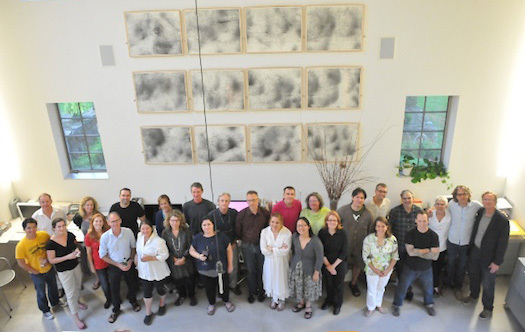
Winterhouse Education Symposium participants at Winterhouse. Photo  © Winterhouse Studio, 2011
Winterhouse Education Symposium participants at Winterhouse. Photo © Winterhouse Studio, 2011

I was humbled and honoured to take part in the second Winterhouse Symposium on Design Education and Social Change, which took place at the Hotchkiss School in Lakeville, Connecticut, August 14-16, 2011.

The symposium’s 28 participants came together to share insights, strategies and concerns about a discipline that has experienced dramatic growth in recent years, yet remains, in its teaching, research and community-oriented practices, inchoate if not chaotic.

For me, this was an intense learning experience and I was thankful for every second of it. William Drenttel and Julie Lasky wrote a final report on the outcomes, which was published and can be read at Design Observer.

Learning from the bricoleur


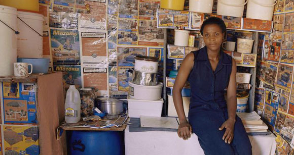
Image: Zwelethu Mthethwa, Untitled (from the series Interiors) (detail), courtesy of the MAD blog.

Disegno is a new design magazine that seeks to bring back long form critical writing and reflection to the design field; it appears in the form of a website, a biannual print magazine, and a series of events. I wrote my first essay for the Disegno website on how contemporary designers seek to emulate the figure and spirit of the bricoleur. As one of the magazine website’s Lessons, I traced back the origin of this term and its current implications, as seen in examples as the Museum of Arts and Design’s recent exhibition “Are You a Hybrid?” curated by North-American designer Stephen Burks, which I also critique. An excerpt is below:

Fascinated by the craftsmanship behind these creations,Are You A Hybrid? is trapped within the boundaries of formalism. Burks’ simplistic presentation of a powerful creative force is representative of the limited Western perception of the figure of the bricoleur. It also implies that this creative impulse can be appropriated and emulated by Western designers, reducing it to a formal trend. But what escapes Burks and much of the Western design world is the true essence of the bricoleur, which cannot be copied or crystallised. Because this creative impulse lives in a state of permanent flux, the stillness of the museum pedestal will only extinguish it. Because this maker only exists in the periphery of society, bringing him to the centre will thwart him.

The Western design world’s selfish fascination with the bricoleur seeks to tame and incorporate this elusive spirit within the discipline’s moulds. But it should instead observe and learn from a creative process that, unlike design, is unskilled and indifferent to conventions and standards. This tenacious, resistant spirit, intrinsic to emerging design scenarios, is already helping the discipline grow and reshape in developing nations. It is now up to the West to catch up.

The complete piece can be seen over at Disegno, as well as some reading suggestions if you’re interested in the topic.

Design Crusades: Considering the Shortcomings of Social Design

On May 4th, our D-Crit class ended the program with a bang, with “Present Tense: The 2011 D-Crit Conference.” Alongside keynote speaker Rob Walker and a star-studded panel on the future of design criticism, every graduating student in our class presented on their thesis findings. My presentation was titled “Design Crusades: Considering the Shortcomings of Social Design,” and for those of you who couldn’t make it, is now available online (with all the other conference videos) and below. Best of all, it was featured in the NYTimes magazine blog as a suggestion for weekend watching!

Two billion laptops to “revolutionize education”: the One Laptop per Child


Children interacting with the OLPC. Photo: OLPC

In anticipation of my presentation next week at Present Tense: The 2011 D-Crit Conference, here’s an investigation on the progress and shortcomings of the One Laptop per Child initiative, which I wrote as part of my masters thesis “Design Crusades: A Critical Reflection on Social Design.” Register for the conference here and come see me talk May 4th at 5.30pm!

There is something about Nicholas Negroponte as he nonchalantly steps onto the stage of TED in February 2006. In dark suit trousers, cotton turtleneck and dark pullover draped over his shoulders, he exudes a cool determination, channeled into his fierce gaze, his resolved step, his compelling words. “This is not something that you have to test,” he says at one point. “The days of pilot projects are over, when people say, ‘Well, we’d like to do three or four thousand in our country to see how it works.’ Screw you. Go to the back of the line and someone else will do it, and then when you figure out that this works, you can join as well. And this is what we’re doing.” The audience laughs and applauds enthusiastically as Negroponte proceeds to unveil and circulate a prototype of the One Laptop per Child (OLPC), the project he chose to dedicate the rest of his life to.

Negroponte is the founder and Chairman Emeritus of the MIT Media Lab, a recognized tech evangelist who in the previous twelve months had changed the course of his life. In January 2005, at the World Economic Forum in Davos, he announced the OLPC, a non-profit organization developing a $100 laptop that “could revolutionize how we educate the world’s children.” Sold to governments of developing countries, the computer would be distributed in mass scale to the two billion of kids in the developing world. Championing the idea of “learning by doing,” Negroponte subscribed to a pedagogical philosophy inspired by MIT colleague Seymour Papert, who defends that giving children computers aids their learning and allows them to explore on their own, outside of an educational system that is often times flawed.

The West promptly bought into and proceeded to finance this idea. In November that year, at the World Summit on the Information Society in Tunis, Negroponte sat next to Kofi Annan to show the first prototype of the little computer. It stood out with bright colors and minute proportions, a yellow crank sticking out to its side that popped out when Kofi Annan tried to turn it. This first concept was the work of Continuum, patched together to show to an eager audience. According to the Continuum’s Kevin Young, the process had to be fast, and there wasn’t much time for research. “We did speak with some educators in developing nations and talked about some of the challenges in that environment, but otherwise this was about trusting the designers’ intuition.”

Continue reading Two billion laptops to “revolutionize education”: the One Laptop per Child

Souto de Moura: a commentary and interview


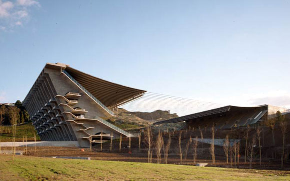
Braga Municipal Stadium, Souto de Moura Arquitectos. Photo: Luis Ferreira Alves

More on the Souto the Moura front: my commentary on the Portuguese Pritzker, as well as an exclusive interview, are now up on The Architect’s Newspaper. It was a pleasure writing a bit more about this Portuguese architect, whose work I like so much. It was great to interview him, too. A small excerpt here,

Your work is full of quotations of work you admire: the Corbusier-type window in your House in Maia, the Xenakis-imposed rhythm in the House in Barrocal, and Mies in the Burgo Office tower, this last one an homage…

The Burgo Tower is not an homage. I quote, because those who cannot write quote. What I don’t want is to start from scratch, which is a waste of time and a sign of little intelligence. If there is a set of circumstances to which architects have answered in a way I admire, I would like to use it, because this is part of the continuity that architecture needs. Architecture is a continuous story. I’m not going to invent a brick angle if Mies already did it in the Dominion Center, but what I can do is to re-think or re-draw it. But I always start from a concrete thing. To start from scratch leads to two things: either it’s stupid, or it leads to an excessive creativity that architecture doesn’t need.

And the full commentary and interview at The Architect’s Newspaper site & April 20th print edition.

It’s African Time


Bibi Seck, Taboo stool. Photo: Bibi Seck.

Próximo Futuro/Next Future is the Gulbenkian Foundation‘s programme of contemporary culture dedicated in particular, but not exclusively, to research and creation in Europe, Latin America and the Caribbean, and Africa. Issue number 6 of their newspaper is now available online, and within it the essay I contributed exploring contemporary African design, titled “It’s African Time” in homage to Heath Nash’s fabulous piece. Here is a small excerpt of the Portuguese original—English translation after the jump:

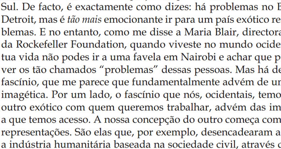
Caracterizar o momento actual do design em África pode parecer, à partida, um esforço fútil. Este é ainda o continente onde a maioria da população continua a ter como preocupação maior arranjar uma refeição ao final do dia e onde 53 países — em breve 54 — diversos em população, tradições e cultura continuam a ser demasiadas vezes rotulados sob uma designação genérica. Mas o design contemporâneo existe, de maneira mais ou menos visível, e está em todo o lado, partilhando traços comuns em nações africanas distintas. O fascínio recente que os círculos de design ocidentais têm por África é apenas mais um capítulo numa relação com altos e baixos. Esse fascínio desdobra-se hoje em duas narrativas distintas, que encarnam duas maneiras essencialmente diferentes de olhar para a criação e produção de design em África. A primeira é a mais linear e glamorosa, e ocorre sobretudo no mundo exclusivo e limitado do design de luxo. A segunda é fragmentada e menos óbvia, mas infinitamente mais promissora.

Continue reading It’s African Time

Beyond


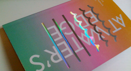
Today SVA’s MFA Design Criticism launches “At Water’s Edge,” the first in the D-Crit Chapbook series. This first volume was edited by Akiko Busch, Saundra Marcel and me, and features 10 essays from the D-Crit graduating class of 2011. You can buy the book on lulu.com or read a review by Alexandra Lange on Design Observer. I am very excited about this project! To celebrate, I share below my contribution to the chapbook—”Beyond.”

On the first day of class in September 2003, Antonio Queirós sat down in front of thirty students at the University of Porto, Portugal, and asked: “What are the words that define each of you?” He proceeded to enumerate this first exercise. Write a list of fifty words that you believe define you. Then reduce it down to three. And then to the one word. You have a week.

Hardly a graphic design exercise, I remember thinking, leaning against a window and trying to evaluate this redheaded forty-something teacher. But then I started my list.

The word I chose was beyond. It sounds pretentious when I say it now, but when I first presented it to class I had the brilliant idea of saying it in Spanish—mas allá. Much better than the Portuguese version of the word, I thought. More accurate, I believed. It reminded me of a folk tale I had heard in my teenage years, in which a firstborn son digs in vain through the hills of the Iberian Peninsula, searching for his dead father’s buried treasure chest. He keeps encountering paper scrolls, every one of them bearing the same message—mas allá, go beyond.
Continue reading Beyond

Tracing Ephemera


MTA token machine, used 1954-1975.

This essay was written for D-Crit’s “Researching Design” class by Steven Heller. Students are forbidden to use Google or any search engine in their research projects, and discover the joys of archives and libraries again. Starting today, I will be posting a weekly essay from my two years at D-Crit.

In a morning like any other morning, you might leave your apartment, walk two blocks to the subway, hope to find a seat in the crowded car and dodge standing passengers while getting out of the car into the station of your choice. The period of time you spend in the subway is uneventful. You read, listen to music, stare into space.

On that particular morning, I was staring into the void after checking out everybody’s shoes, when the PA announcer started trailing off the usual audio script. “Have a good day,” she said. “It’s Friday, almost the end of the week. Have yourself a good weekend, too. Don’t forget to take all of your belongings with you, and please mind the gap between the train and the platform”. This nice interlude woke me from my trance, and I noticed everybody on the train car was smiling.

“Even the conductors sometimes embellish the PA ads,” Doris Halle pointed out to me, over the telephone. According to Ms. Halle, formerly Chief of Corporate Design at the Metropolitan Transit Authority, the people that spend so much time underground in the New York City Subway, whether conductors, station agents or booth agents, find a way to make the subway system a little bit theirs, too. Whether a message written for the day on the station booth, or a sign posted on the platform columns indicating which way to go during a weekend traffic change, MTA staff adds on to the existing subway signage system, in complex, humorous, and whimsical ways.

These characteristics were first apparent to me when I looked at the token machines on display at the MTA Transit Museum. One of them stood out immediately. It was red and black, simple in its rectangular lines, and heavily customized during the period of 1954 to 1975, when it was in use. During this period, the fare amount increased four times, from 15 cents in 1954, to 35 cents in 1972, and several changes had been made to the amount that should be inserted in the machine. By adding tape, painting arrows or sticking hand-cut letters, the machine had evolved through time, becoming a hybrid object that told the story of the people that had customized it. The details were gritty and unkempt, but the additions had been done with care and some amount of logic. This was undoubtedly the product of the intense labor of some MTA employee.

Customized out of necessity, this token machine existed completely out of synch of the rest of the subway signage system. But when had the MTA staff first started intervening in the signage system? And had these interventions been consistent throughout time?
Continue reading Tracing Ephemera
An unexpected Pritzker


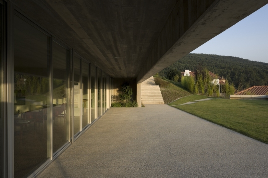
Casa das Artes, by Souto de Moura Arquitectos. Photo by Luis Ferreira Alves

With Eduardo Souto Moura’s surprising Pritzker win, I contributed a small post for the Metropolis blog trying to bring the architect’s work into context. Truth is, I really like his work, and lived around it for five years while in college. Here’s an excerpt:

In Porto, Portugal, where Souto Moura—we usually drop the “de”—has lived, taught and worked for the last thirty years, the architect is quite a celebrity. The northern part of Portugal is where you can find most of his strongest body of work—his houses. With each single family dwelling, Souto Moura has refined a style that is rigorous, grounded and muscular; minimal—the influence of both Mies and Siza are felt—but detailed in the way the volume is inserted into the landscape and the space unfolds within.

Read more over at the Metropolis Blog.